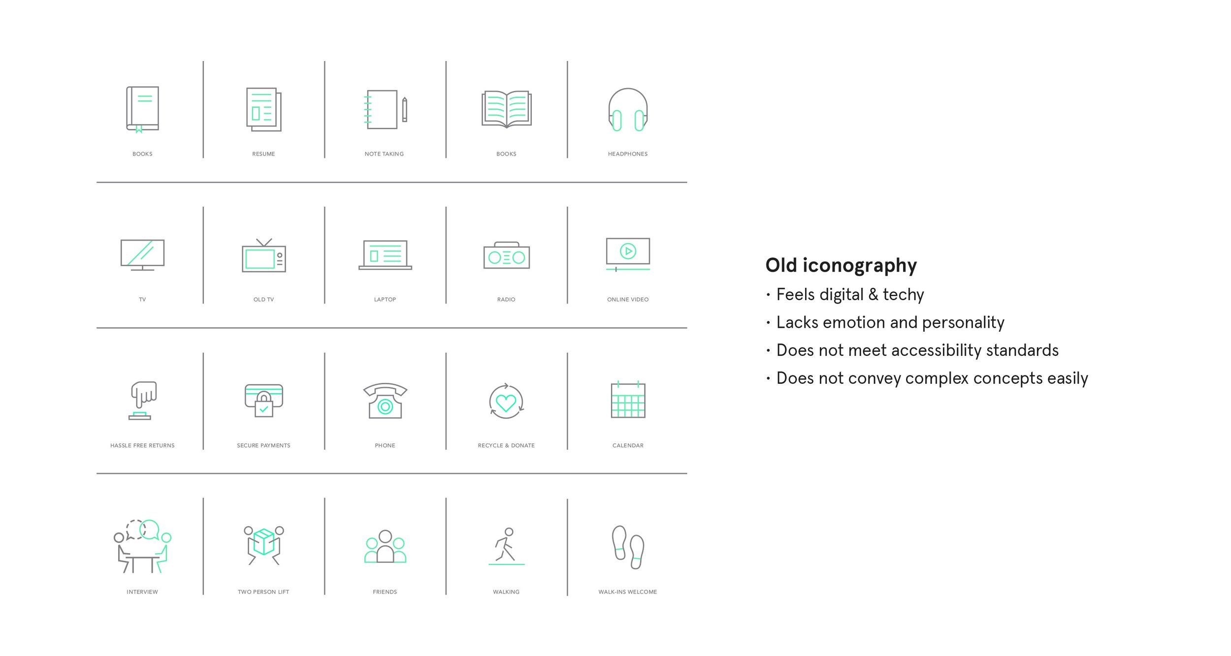
In 2022, my team overhauled Tuft & Needle’s suite of icons. Over the years, our brand had evolved from a disrupting tech startup to a sleep wellness company and the style of our icons felt too techy and lacked emotion. They also did not meet accessibility standards and their style was a bit too simple to easily communicate complex concepts.
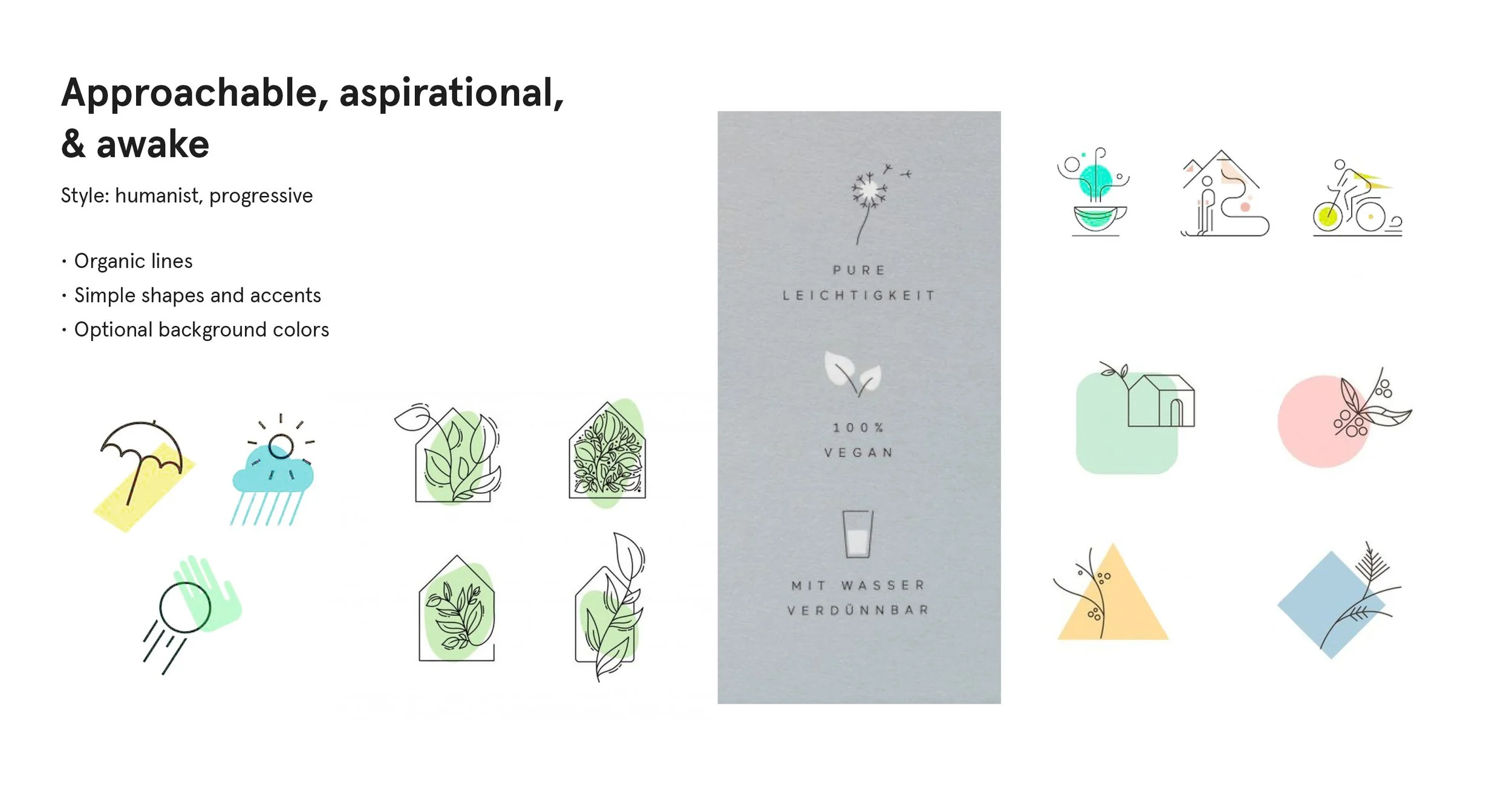
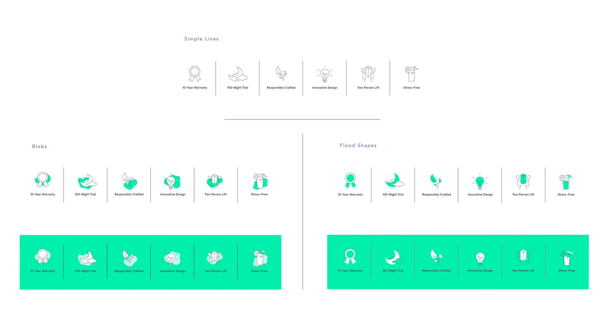
We worked with marketing leadership to explore how our brand’s principles aligned with various icon styles. We also considered how our icons would be presented, both digitally and in print. Our solution was a system of icons that use organic shapes in a single color with an optional flood of mint green for applications where the icons need more presence.
Tuft & Needle
Iconography System
creative direction — illustration

Tuft & Needle's old icon style

Matrix of brand filters and icon styles

We aligned with leadership on this direction

We explored various ways of incorporating T&N's mint green color

The suite of icons continues to grow
